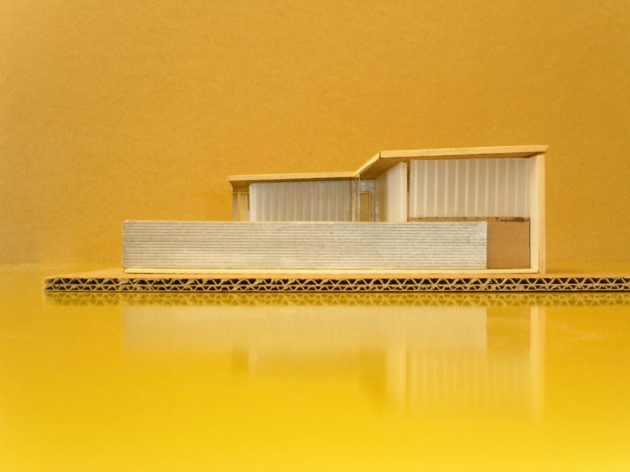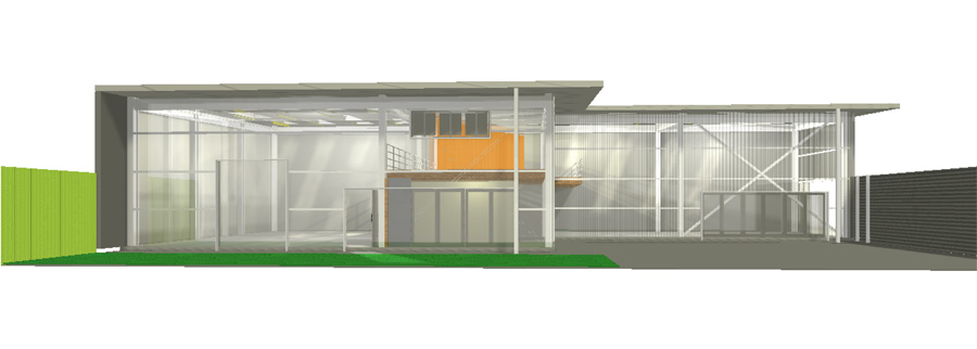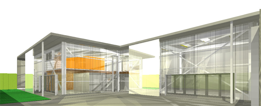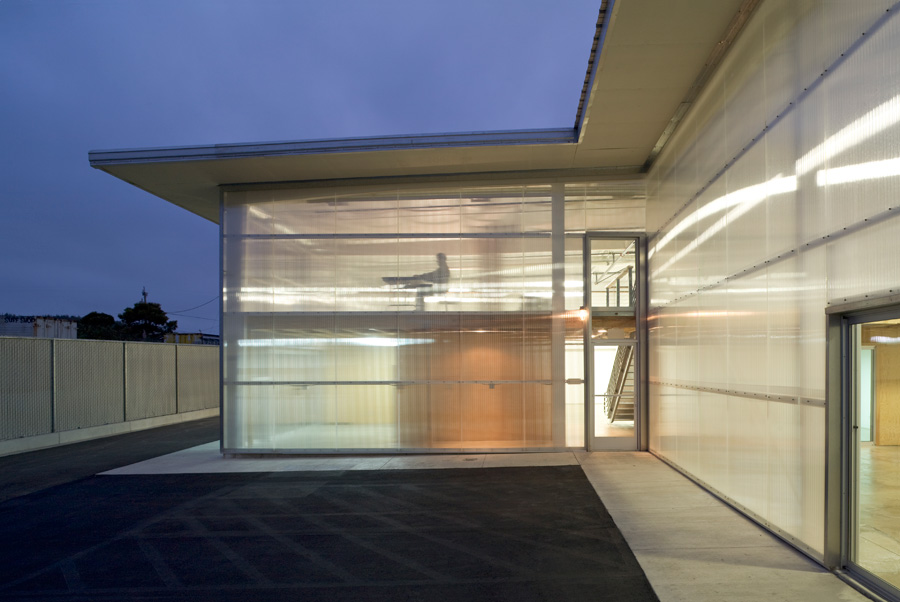
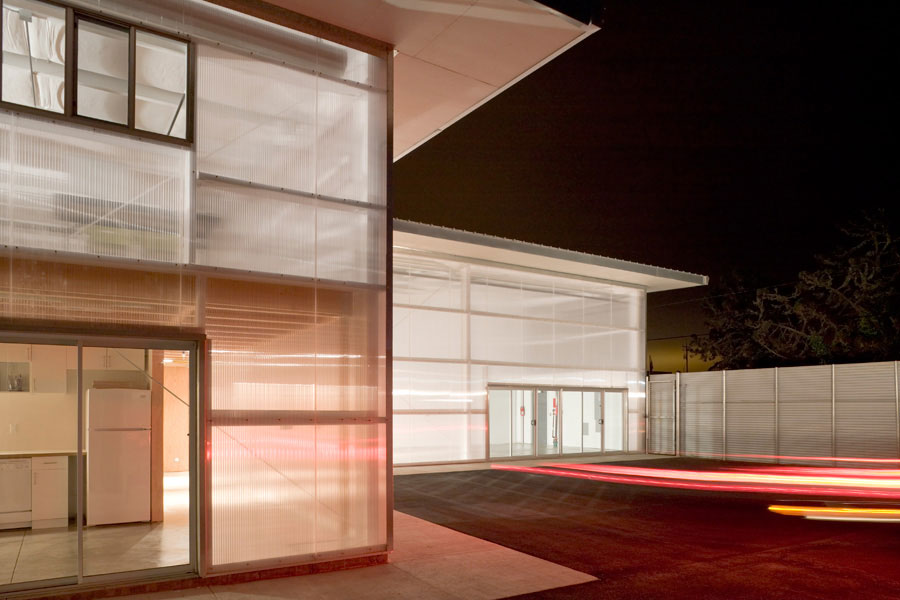
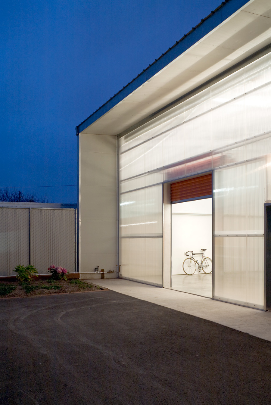
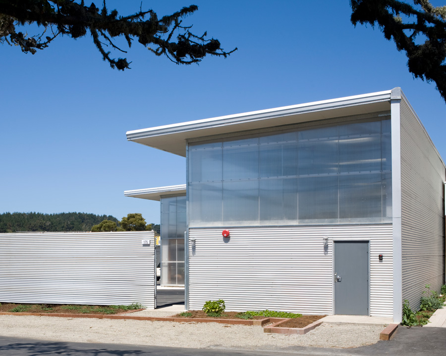
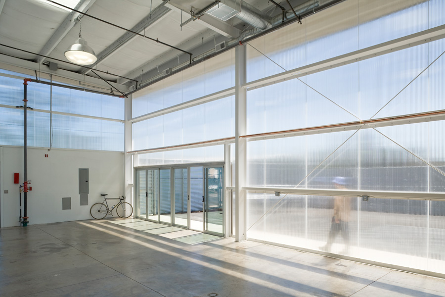
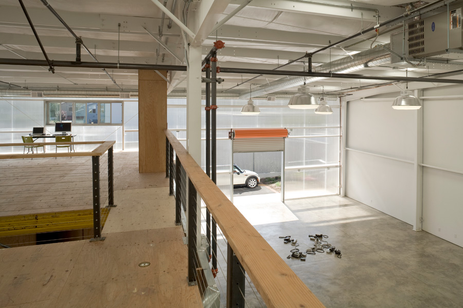
The design strategy of C2 – a graphic design/brand identity studio located in Half Moon Bay is “Think Wrong”, i.e. disrupt the status quo. This strategy was applied to their studio space, which is a manufactured steel building rethought and reconfigured. The studio benefits from the efficiency and economy of a manufactured steel building, while making a few key alterations like adding polycarbonate siding and using an L-shaped plan to give the building a unique architectural identity.
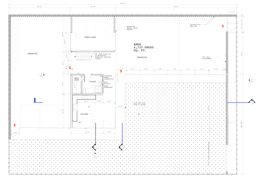
The building was devised as an L-shaped plan in order to provide each of the two main functions of the design studio – studio space and charrette space for client meetings – with its own distinctive space. The L-shaped plan also defines an exterior courtyard, which can be used for outdoor events and exhibitions.
The building was sited with the courtyard facing southwest for the optimal solar orientation. Overhangs were utilized to protect the polycarbonate from heat gain – they also define the outer edge of the walkway at the ground level.
